As soon as you make a website with WordPress and make some posts with a YouTube video link, you will notice that the video may not be responsive in mobile view. Responsiveness is the new trend in the whole website industry and son nobody can go-ahead without making the YouTube videos mobile responsive.
Though most of the WordPress themes are equipped with mobile responsive design you cannot guarantee that it is also optimized for displaying iFrame embeds such as the Youtube videos, especially for free themes and blogs.
Making Embedded YouTube Videos responsive
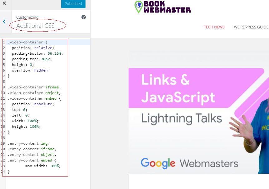
Paste the following code in your current themes style.css file as seen in the screenshot below by moving to Appearance -> Customize -> Additional CSS
.video-container {
	position: relative;
	padding-bottom: 56.25%;
	padding-top: 30px;
	height: 0;
	overflow: hidden;
}

.video-container iframe,
.video-container object,
.video-container embed {
	position: absolute;
	top: 0;
	left: 0;
	width: 100%;
	height: 100%;
}

.entry-content img,
.entry-content iframe,
.entry-content object,
.entry-content embed {
        max-width: 100%;
}
Paste the code as seen below and publish it:

Now whenever you embed a video in a page or post, add the div tag with the class .video-container.
<div class="video-container"> Video Embed Code </div>
For example, embedding a youtube video
<div class="video-container">
<iframe width="560" height="315" src="https://www.youtube.com/embed/4vtVUBzw9Rs" frameborder="0" allowfullscreen></iframe>
</div>
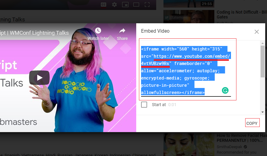
The Video Embed Code highlighted in red color to be copied from the YouTube Video -> Share -> Embed as seen in the screenshot:

Here you can check the demo of a responsive YouTube Video after following the above-mentioned steps.
If you prefer plugins for making responsive Youtube videos then use Advanced Responsive Video Embedder.


